Rate Tutorial
Introduction
Hello everyone! I’m Lisa, and today I’m here to show you a few ways to pick different colour combinations for your bracelets, plus some extra tips and tricks as well as some recommendations for picking your bracelet colours. Personally I love the process of picking out colours for my bracelets but I know lots of people struggle with this. Hopefully you learn something new, and have fun!
Contents
Introduction
Section 1. Colour Schemes
Section 2. Themes
Section 3. Tools and Softwares
Section 4. Palette Suggestions and Examples
Section 5. Tips and Tricks
Conclusion
Section 1. Colour Schemes
Section 2. Themes
Section 3. Tools and Softwares
Section 4. Palette Suggestions and Examples
Section 5. Tips and Tricks
Conclusion
Colour schemes
First, I’ll be going through some of the popular colour schemes; I’ll cover less common types later in this section.
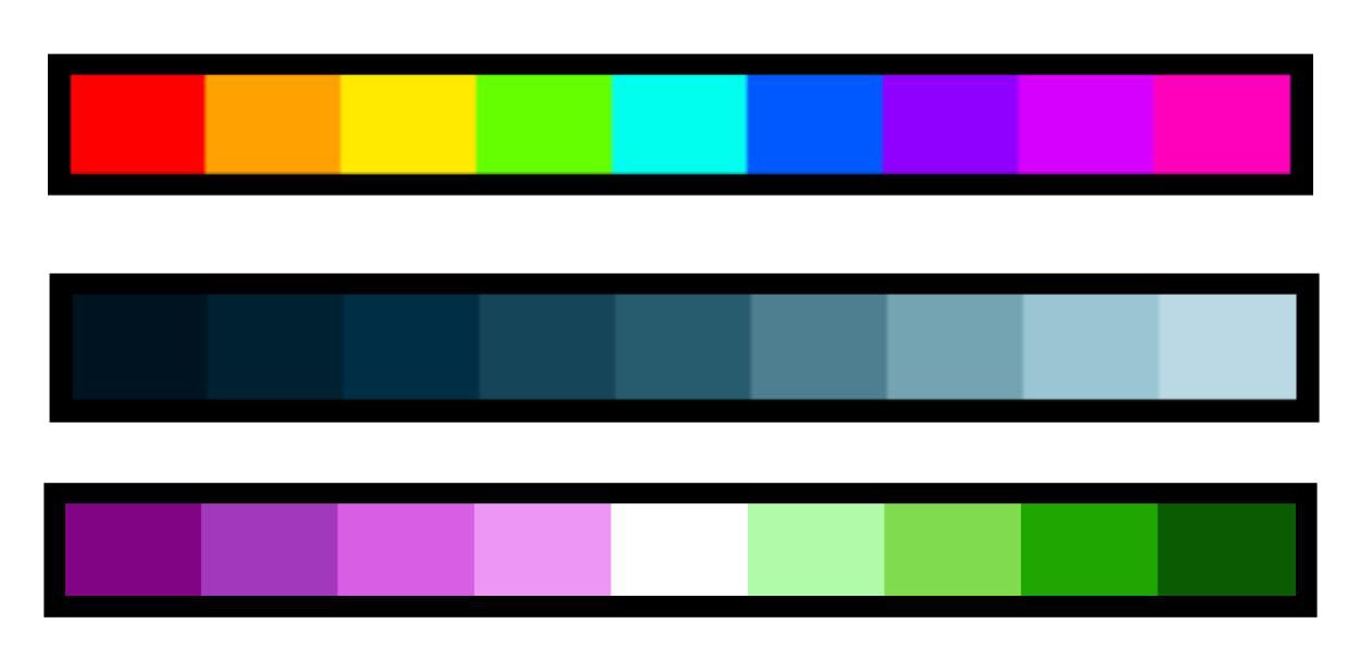
1. Rainbow: one of the most classic colour schemes! You can’t go wrong with rainbows. They look awesome in bracelets or sections with no particular defined sections, like the candy stripe, chevron, fishbone chevron, etc...
2. Gradient/ombre: another very commonly used colour scheme; this is one of my personal favourites! You can use it in almost any pattern, especially when it gives your bracelet a 3D effect.
3. Opposite colour gradient: what I mean by this is using gradients of two contrasting colours (opposite or almost opposite on the colour spectrum) in your bracelet. It creates a really cool effect, but it might be hard to find a pattern that works well with it. An example that would work well is #33616.
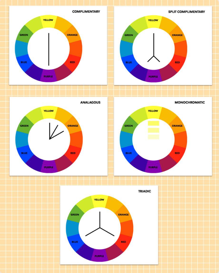
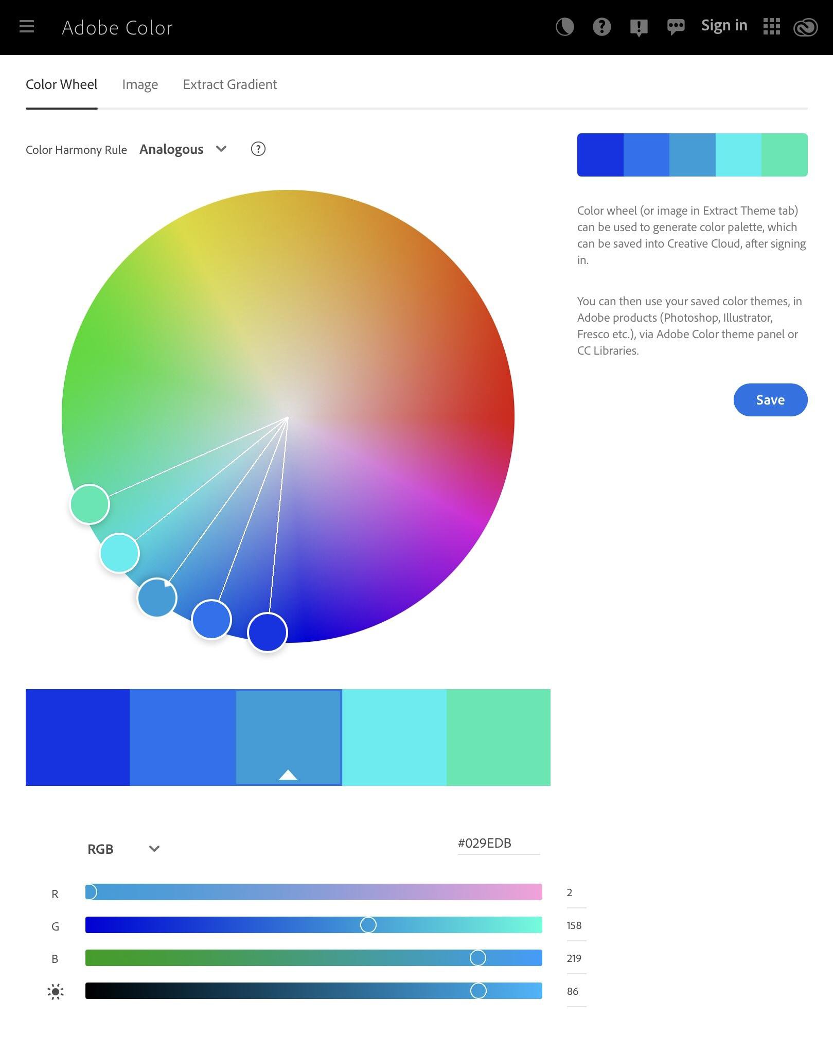
Now let’s get deeper into the different colour schemes! I am now showing you the colour schemes based on the colour wheel. They are called ‘colour harmonies’, which are explained below. (I haven’t included all of them, but the most common ones are here.) See the image for some examples!
1. Complementary colours: basically what I said above; two colours that are opposite on the colour wheel. This also works well without a gradient; you can use this in patterns with 3 or 4 colours, one or two of which are white or black, with the complementary colours being the other two.
2. Split complementary colours: it’s a little hard to explain this one. They are similar to the complementary colours, but instead of two colours, there are three. One of which is opposite of the other two, while the other two colours are the ones next to the colour directly opposite the first. If this is confusing, check the image for an example!
3. Analogous colours: three different colours sitting next to each other on the colour wheel. They are different to gradients, because they aren’t shades of the same colour. It’s kind of similar to a rainbow but with fewer colours.
4. Monochromatic colours: this is just a fancy name for gradients, but I put it here in case you’re interested! Basically shades of a single colour.
5. Triadic colours: triadic colours form an equilateral triangle on the colour wheel. I can’t really explain this further, so just look at the image if you want an example!
Themes
Of course, there are way more options than that. If you're looking for inspiration for a certain pattern you already have in mind, I’ve compiled a list of ways you can easily find colours for it!
1. Match it up with the vibe of your pattern. If you’re going for a seasonal themed bracelet, for instance, match it up with what colours the season reminds you of. If you’re going festive, then use the colours that represent the festivity!h
2. Use coordinated colours. If you want a well-balanced yet not too ‘busy’ colour combo, then think about the colour harmonies above!
3. Get inspiration from daily life. Whenever I see something that really captures my attention, even if it’s just a colourful dish, I remember the colours as a new combo to try out.
4. Experiment! Another great way to test out a combo you’re unsure about is to put it into the Pattern Generator. This way you can test out different colours and make sure you’re happy with the result!
Tools and Softwares
If you are still looking for different ways to come up with colour combinations, don’t forget that there are many great tools online that you can use to generate colour palettes.
(**This is not sponsored. I am simply stating my personal opinions and there are many other tools you can use to help you!**)
(**This is not sponsored. I am simply stating my personal opinions and there are many other tools you can use to help you!**)
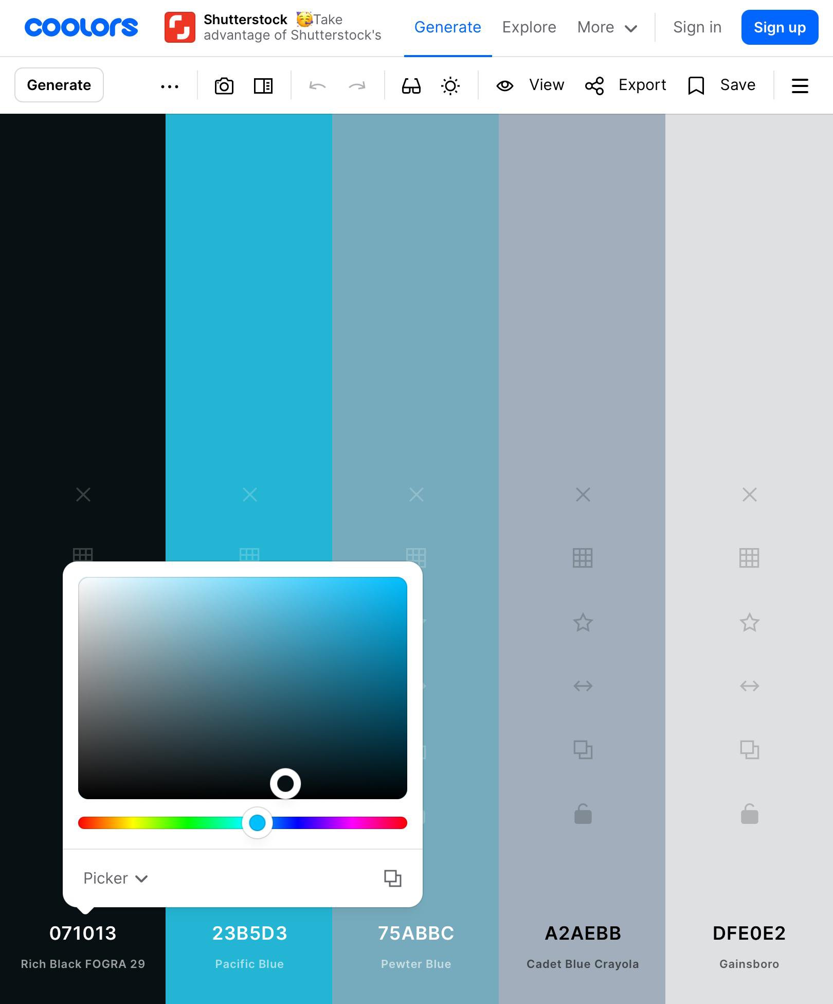
Coolors
Coolors is a simple, convenient and clear tool that you can use to generate different colour palettes. It is both available online and as a mobile app. The plus is that you can have up to 10 colours in one palette, which should be enough for most bracelets. The downside is that the mobile app costs a bit of money, however you can use the web version for free without an account. You can also upload images for Coolors to collect colours from it, browse palettes and save palettes.
Color Collect
Color Collect is designed for mobile devices and the app is free to use. There is a pro option which costs money but if you’re just looking for a simple tool to use to generate some colours, none of that is necessary at all. It is similar to Coolors but is slightly more simplistic. You are also able to upload images, browse and save palettes.
Adobe Color
Color is available on the web and is a slightly different kind of generator. It generates colour harmonies, and is a great tool if you want to get deeper into this. There’s also a ‘custom’ option which works similarly to both Coolors and Color Collect. You can also upload images, browse other palettes and save palettes.
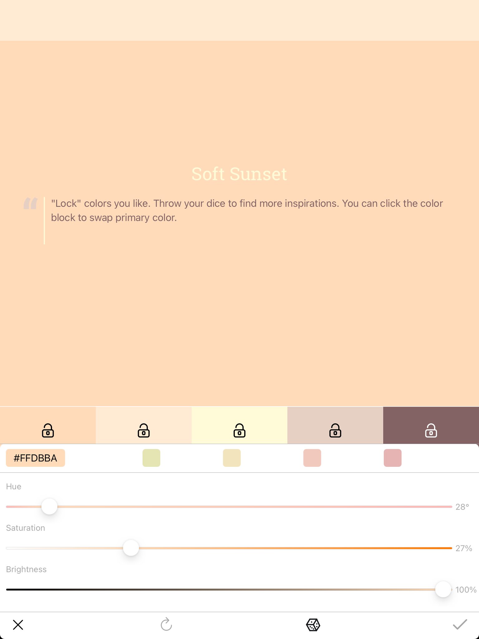
Palette Suggestions and Examples
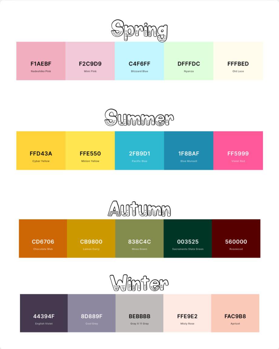
Of course, I have already collected lots of palettes that I love! I’ve put together this list so that you can check them out as well. I’ve written the hex (#) number for each colour, and you can refer to the image for these colour combos. Just add a black or white and you’re ready to go! (Or you might not even need to!)
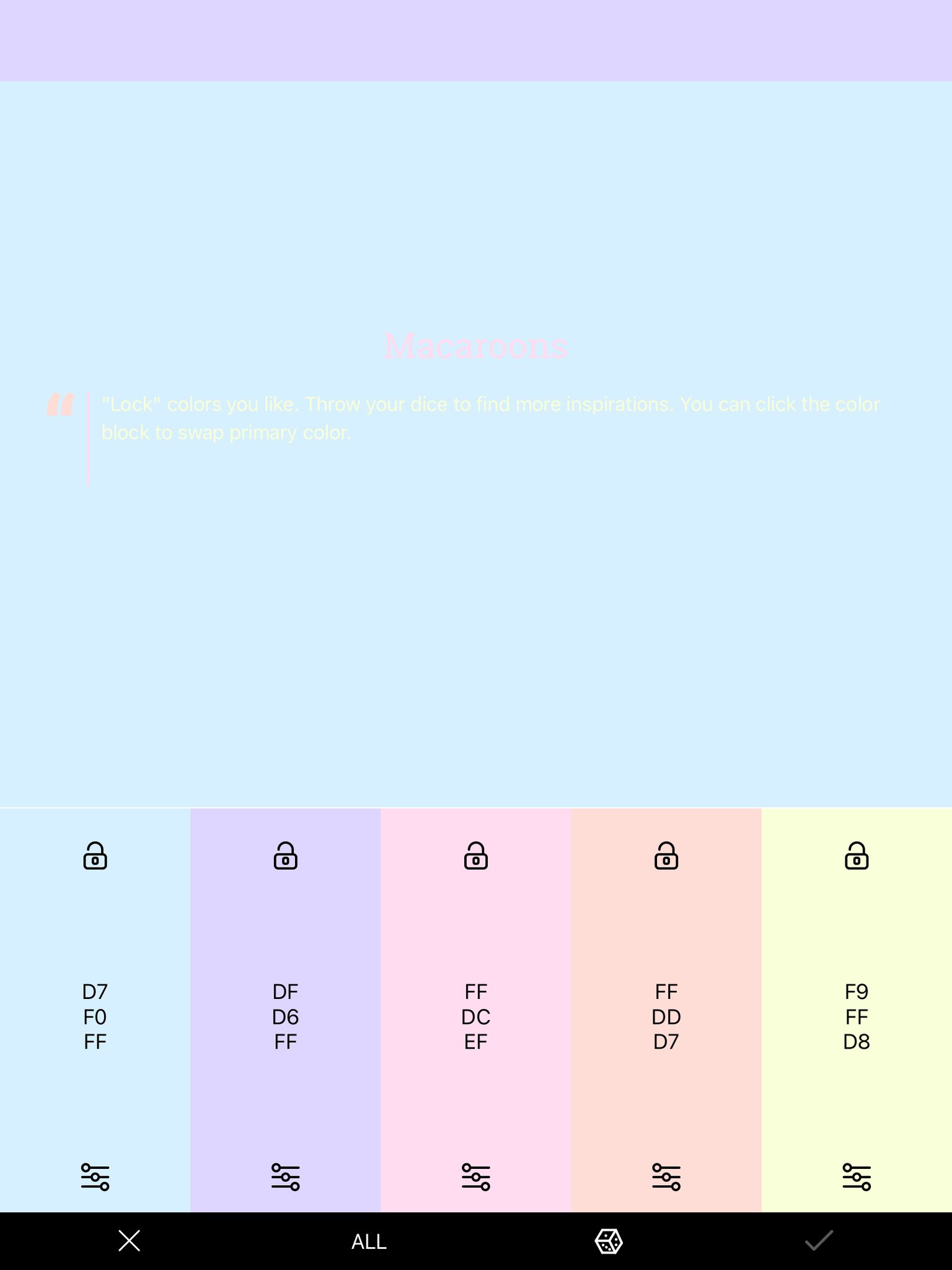
Macaroons
D7F0FF
DFD6FF
FFDCEF
FFDDD7
F9FFD8
DFD6FF
FFDCEF
FFDDD7
F9FFD8
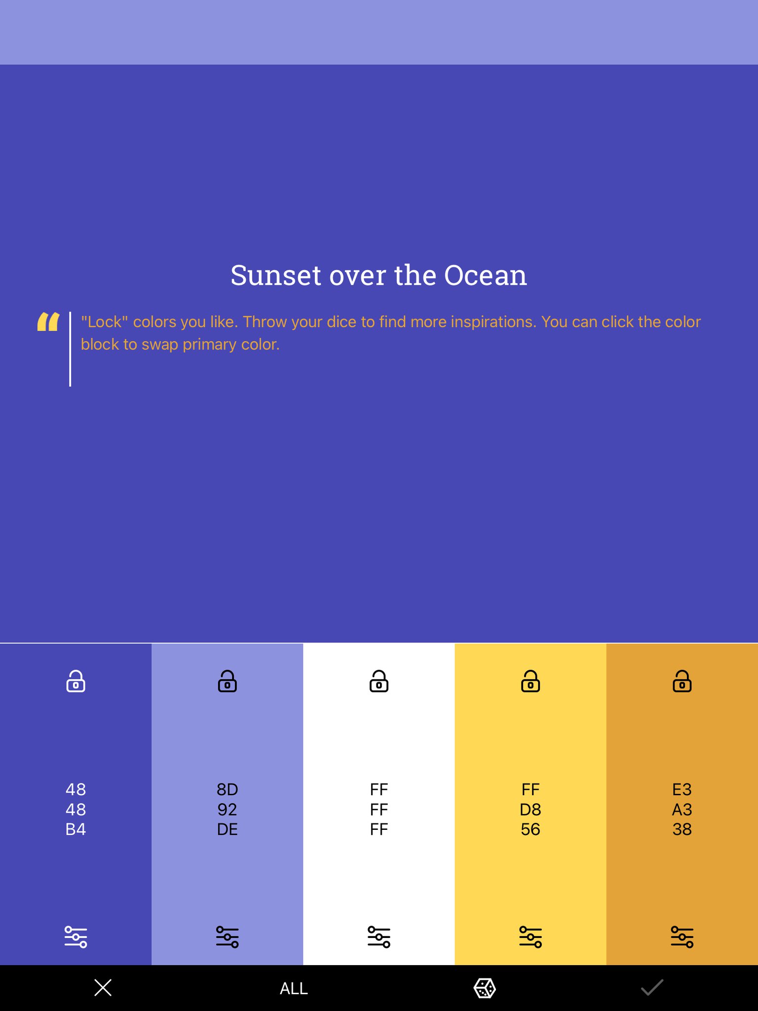
Sunset over the Ocean
4848B4
8D92DE
FFFFFF
FFD856
E3A338
8D92DE
FFFFFF
FFD856
E3A338
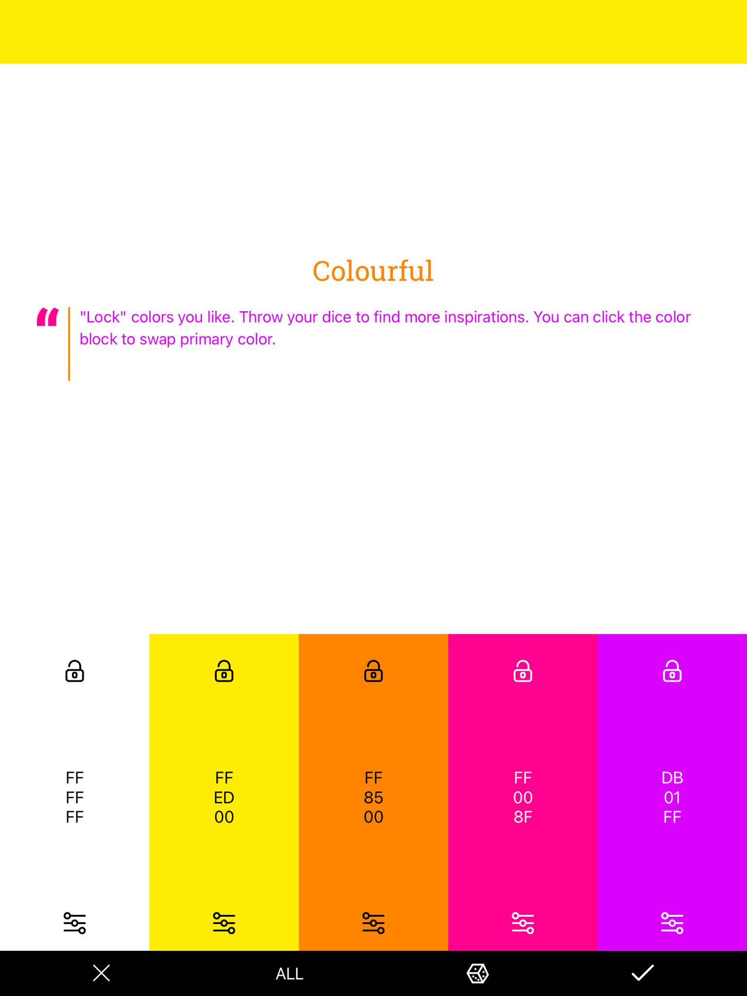
Colourful
FFFFFF
FFED00
FF8500
FF008F
DB01FF
FFED00
FF8500
FF008F
DB01FF
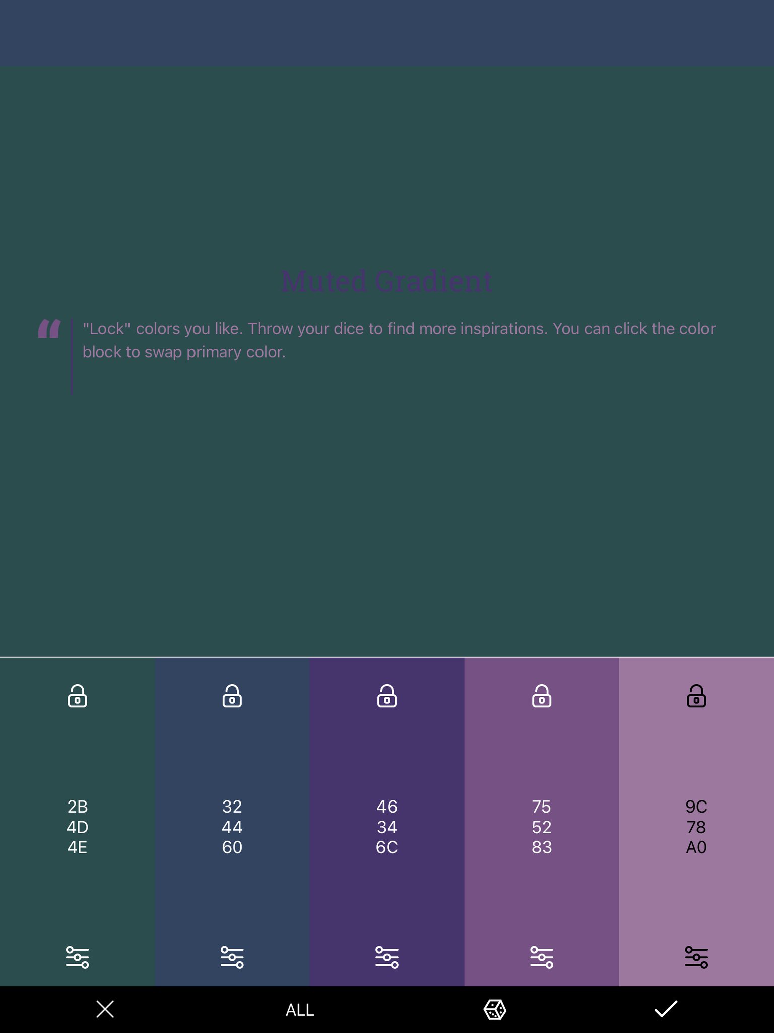
Muted Gradient
Tips and Tricks
I’ve gone through a lot already, and we’re nearing the end of this tutorial. Finally, I’d like to give you a few tips and tricks and a summary of everything I’ve just explained.
1. Keep the colour harmonies in mind. When you’re running out of ideas, just use a colour wheel to come up with some.
2. Themes! If you’re making a pattern for a specific season, time or event, think about the corresponding colours that come to mind. This might already be obvious, but it’s a great way to find combos if you can’t think of any!
3. Try some websites and apps. The ones I mentioned above are a great place to start! You can do a quick google search to find them, among many others!
4. Make variations on BraceletBook. This lets you both test out new colour combinations to use straight from the pattern, and you’re contributing to and supporting the BB community!
5. Don’t be afraid to try new things. I find inspiration from everywhere. Keep experimenting and trying out new colour combos!
Conclusion
That’s it for this tutorial! I really hope you enjoyed it. Hopefully I created inspiration for your projects! Thanks, and feel free to ask me if you have any questions. Until next time!
- Lisa
- Lisa